Engage Cost Estimator
Making Healthcare Costs Make Sense for 3.25M+ Users
Duration
Jun - Aug 2025 (9 Weeks)
Jun - Aug 2025 (9 Weeks)
Role
UX Design Intern
UX Design Intern
Reported to
Guru Sai (Sr. UX Manager)
Guru Sai (Sr. UX Manager)

CONTEXT
Engage Cost Estimator (ECE) is a consumer software tool that lets healthcare plan members estimate treatment costs before care.
CONTEXT
Engage Cost Estimator (ECE) is a consumer software tool that lets healthcare plan members estimate treatment costs before care.
CONTEXT
Engage Cost Estimator (ECE) is a consumer software tool that lets healthcare plan members estimate treatment costs before care.
PROBLEM
Patients need clear, trustworthy cost estimates, but the legacy tool gave them clutter, outdated visuals, and information overload instead, eroding trust and causing drop-off.
"It's not like any other user interface out there... we've been tripping through it, for lack of a better term." - Client
-20
Net Promoter Score
Without trust in the tool, users return to guessing, delaying, or avoiding treatment—while TriZetto risks an underperforming product and losing clients to competitors.
PROBLEM
Patients need clear, trustworthy cost estimates, but the legacy tool gave them clutter, outdated visuals, and information overload instead, eroding trust and causing drop-off.
"It's not like any other user interface out there... we've been tripping through it, for lack of a better term." - Client
-20
Net Promoter Score
Without trust in the tool, users return to guessing, delaying, or avoiding treatment—while TriZetto risks an underperforming product and losing clients to competitors.
PROBLEM
Patients need clear, trustworthy cost estimates, but the legacy tool gave them clutter, outdated visuals, and information overload instead, eroding trust and causing drop-off.
"It's not like any other user interface out there... we've been tripping through it, for lack of a better term." - Client
-20
Net Promoter Score
Without trust in the tool, users return to guessing, delaying, or avoiding treatment—while TriZetto risks an underperforming product and losing clients to competitors.
SOLUTION
An evolved ECE that replaces clutter with clarity, giving patients a consumer-grade experience they can trust.
SOLUTION
An evolved ECE that replaces clutter with clarity, giving patients a consumer-grade experience they can trust.
SOLUTION
An evolved ECE that replaces clutter with clarity, giving patients a consumer-grade experience they can trust.

HOW I GOT THERE
I interviewed internal stakeholders to surface pain points in the absence of direct client access, reviewed the feature-request and complaint backlog alongside past user interview transcripts to ground those insights in real user language, and benchmarked the legacy tool against three competitors to define what "modern" should look like.
HOW I GOT THERE
I interviewed internal stakeholders to surface pain points in the absence of direct client access, reviewed the feature-request and complaint backlog alongside past user interview transcripts to ground those insights in real user language, and benchmarked the legacy tool against three competitors to define what "modern" should look like.
HOW I GOT THERE
I interviewed internal stakeholders to surface pain points in the absence of direct client access, reviewed the feature-request and complaint backlog alongside past user interview transcripts to ground those insights in real user language, and benchmarked the legacy tool against three competitors to define what "modern" should look like.
WHAT I FOUND OUT + HOW I FIXED IT
Finding 1: Critical info was buried, with no hierarchy
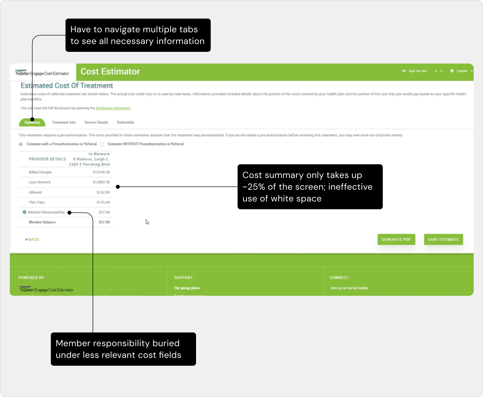
Important cost information was split across four tabs, and the summary itself forced users through billed charges, network status, and plan-pays amounts before reaching member responsibility, the number they came for.
Finding 1: Critical info was buried, with no hierarchy
Important cost information was split across four tabs, and the summary itself forced users through billed charges, network status, and plan-pays amounts before reaching member responsibility, the number they came for.
Finding 1: Critical info was buried, with no hierarchy
Important cost information was split across four tabs, and the summary itself forced users through billed charges, network status, and plan-pays amounts before reaching member responsibility, the number they came for.
Fix 1: One page, ordered by priority
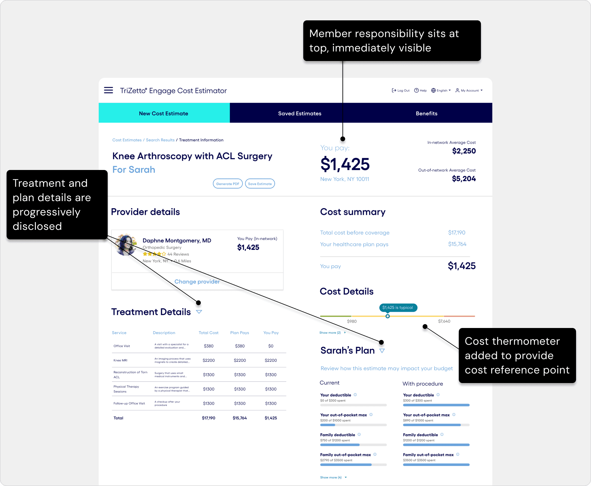
I consolidated all four tabs into a single page, leading with member responsibility, since that's the number patients came for. Treatment and plan details moved into dropdowns so they're available without slowing down users who don't need them. I also added a cost thermometer to give patients a reference point, since context helps people make informed decisions.
Fix 1: One page, ordered by priority
I consolidated all four tabs into a single page, leading with member responsibility, since that's the number patients came for. Treatment and plan details moved into dropdowns so they're available without slowing down users who don't need them. I also added a cost thermometer to give patients a reference point, since context helps people make informed decisions.
Fix 1: One page, ordered by priority
I consolidated all four tabs into a single page, leading with member responsibility, since that's the number patients came for. Treatment and plan details moved into dropdowns so they're available without slowing down users who don't need them. I also added a cost thermometer to give patients a reference point, since context helps people make informed decisions.
Finding 2: No costs visible when selecting providers
Users had to select up to 5 providers blind, which generated a cost table laid out as dense text with no visual hierarchy. While selecting, a fixed filter panel ate a quarter of the screen at all times, cluttered with fields that weren't really filter criteria (e.g., Phone Number). Furthermore, the compare CTA was hidden below the fold, meaning users had to scroll to find it.

Finding 2: No costs visible when selecting providers
Users had to select up to 5 providers blind, which generated a cost table laid out as dense text with no visual hierarchy. While selecting, a fixed filter panel ate a quarter of the screen at all times, cluttered with fields that weren't really filter criteria (e.g., Phone Number). Furthermore, the compare CTA was hidden below the fold, meaning users had to scroll to find it.
Finding 2: No costs visible when selecting providers
Users had to select up to 5 providers blind, which generated a cost table laid out as dense text with no visual hierarchy. While selecting, a fixed filter panel ate a quarter of the screen at all times, cluttered with fields that weren't really filter criteria (e.g., Phone Number). Furthermore, the compare CTA was hidden below the fold, meaning users had to scroll to find it.
Fix 2: Compare what actually matters
Cost is now visible on every card before users select providers. The filter no longer takes up permanent screen space, and the comparison caps at 3, the number research showed people could actually reason about. The compare action is also always on screen, not buried below a scroll.

Fix 2: Compare what actually matters
Cost is now visible on every card before users select providers. The filter no longer takes up permanent screen space, and the comparison caps at 3, the number research showed people could actually reason about. The compare action is also always on screen, not buried below a scroll.
Fix 2: Compare what actually matters
Cost is now visible on every card before users select providers. The filter no longer takes up permanent screen space, and the comparison caps at 3, the number research showed people could actually reason about. The compare action is also always on screen, not buried below a scroll.
ADDITIONAL DESIGN OPPORTUNITIES
Beyond the two core structural fixes, I identified several smaller opportunities to make the experience feel more consumer-friendly and complete:
Simplified Search
Simplified Search
I reduced the search flow to ask for less upfront, so patients aren't overwhelmed before they've even started.
I reduced the search flow to ask for less upfront, so patients aren't overwhelmed before they've even started.

A Real Provider Profile
I replaced a bare list of provider details with a full profile: map, hours, reviews, and more. Drawing from user requests, I included everything patients actually weigh when choosing who treats them.

A Real Provider Profile
I replaced a bare list of provider details with a full profile: map, hours, reviews, and more. Drawing from user requests, I included everything patients actually weigh when choosing who treats them.
A Real Provider Profile
I replaced a bare list of provider details with a full profile: map, hours, reviews, and more. Drawing from user requests, I included everything patients actually weigh when choosing who treats them.
Context Clues
Context Clues
I added contextual features like tooltips, an AI chatbot, and breadcrumbs so users can always stay in the know while never having to leave the flow.
I added contextual features like tooltips, an AI chatbot, and breadcrumbs so users can always stay in the know while never having to leave the flow.



VISUAL DESIGN
TriZetto had no existing design system to build from, so I built one from the ground up, grounded in Cognizant's (TriZetto's parent company) brand guidelines. This gave the redesign a foundation for consistency, accessibility (contrast, type scale), and scalability, so components could be reused and extended well beyond this one flow.
VISUAL DESIGN
TriZetto had no existing design system to build from, so I built one from the ground up, grounded in Cognizant's (TriZetto's parent company) brand guidelines. This gave the redesign a foundation for consistency, accessibility (contrast, type scale), and scalability, so components could be reused and extended well beyond this one flow.
VISUAL DESIGN
TriZetto had no existing design system to build from, so I built one from the ground up, grounded in Cognizant's (TriZetto's parent company) brand guidelines. This gave the redesign a foundation for consistency, accessibility (contrast, type scale), and scalability, so components could be reused and extended well beyond this one flow.

OUTCOMES
30%
30%
Reduction in time-to-estimate
Reduction in time-to-estimate
>50%
>50%
Improvement in perceived usability
Improvement in perceived usability
+80 pt
+80 pt
Projected increase in NPS
Projected increase in NPS
I delivered an end-to-end interactive prototype with a scalable design system, ready for dev handoff. I also presented the redesign to clients and executives, with a post-presentation survey yielding positive feedback. Client user sessions are now underway to validate and refine the redesign before final handoff to engineering.
REFLECTIONS + LESSONS LEARNED
LESSONS
LEARNED
This project came with real constraints: no direct client or user access, and legacy files on a deprecated platform with no existing design system. Here's what that taught me:
This project came with real constraints: no direct client or user access, and legacy files on a deprecated platform with no existing design system. Here's what that taught me:
Less is more.
Less is more.
All the information mattered, just not all at once. Progressive disclosure turned a wall of data into something that actually felt calm to use.
Design for the moment.
Design for the moment.
A screen is never used in isolation. Patients may be comparing costs while navigating a health crisis, so every design decision had to account for more than just interface logic.
Engage Cost Estimator
Making Healthcare Costs Make Sense for 3.25M+ Users
Duration
Jun - Aug 2025 (9 Weeks)
Jun - Aug 2025 (9 Weeks)
Role
UX Design Intern
UX Design Intern
Reported to
Guru Sai (Sr. UX Manager)
Guru Sai (Sr. UX Manager)
CONTEXT
Engage Cost Estimator (ECE) is a consumer software tool that lets healthcare plan members estimate treatment costs before care.
CONTEXT
Engage Cost Estimator (ECE) is a consumer software tool that lets healthcare plan members estimate treatment costs before care.
CONTEXT
Engage Cost Estimator (ECE) is a consumer software tool that lets healthcare plan members estimate treatment costs before care.
PROBLEM
Patients need clear, trustworthy cost estimates, but the legacy tool gave them clutter, outdated visuals, and information overload instead, eroding trust and causing drop-off.
"It's not like any other user interface out there... we've been tripping through it, for lack of a better term." - Client
-20
Net Promoter Score
Without trust in the tool, users return to guessing, delaying, or avoiding treatment—while TriZetto risks an underperforming product and losing clients to competitors.
PROBLEM
Patients need clear, trustworthy cost estimates, but the legacy tool gave them clutter, outdated visuals, and information overload instead, eroding trust and causing drop-off.
"It's not like any other user interface out there... we've been tripping through it, for lack of a better term." - Client
-20
Net Promoter Score
Without trust in the tool, users return to guessing, delaying, or avoiding treatment—while TriZetto risks an underperforming product and losing clients to competitors.
PROBLEM
Patients need clear, trustworthy cost estimates, but the legacy tool gave them clutter, outdated visuals, and information overload instead, eroding trust and causing drop-off.
"It's not like any other user interface out there... we've been tripping through it, for lack of a better term." - Client
-20
Net Promoter Score
Without trust in the tool, users return to guessing, delaying, or avoiding treatment—while TriZetto risks an underperforming product and losing clients to competitors.
SOLUTION
An evolved ECE that replaces clutter with clarity, giving patients a consumer-grade experience they can trust.
SOLUTION
An evolved ECE that replaces clutter with clarity, giving patients a consumer-grade experience they can trust.
SOLUTION
An evolved ECE that replaces clutter with clarity, giving patients a consumer-grade experience they can trust.
HOW I GOT THERE
I interviewed internal stakeholders to surface pain points in the absence of direct client access, reviewed the feature-request and complaint backlog alongside past user interview transcripts to ground those insights in real user language, and benchmarked the legacy tool against three competitors to define what "modern" should look like.
HOW I GOT THERE
I interviewed internal stakeholders to surface pain points in the absence of direct client access, reviewed the feature-request and complaint backlog alongside past user interview transcripts to ground those insights in real user language, and benchmarked the legacy tool against three competitors to define what "modern" should look like.
HOW I GOT THERE
I interviewed internal stakeholders to surface pain points in the absence of direct client access, reviewed the feature-request and complaint backlog alongside past user interview transcripts to ground those insights in real user language, and benchmarked the legacy tool against three competitors to define what "modern" should look like.
WHAT I FOUND OUT + HOW I FIXED IT
Finding 1: Critical info was buried, with no hierarchy
Important cost information was split across four tabs, and the summary itself forced users through billed charges, network status, and plan-pays amounts before reaching member responsibility, the number they came for.
Finding 1: Critical info was buried, with no hierarchy
Important cost information was split across four tabs, and the summary itself forced users through billed charges, network status, and plan-pays amounts before reaching member responsibility, the number they came for.
Finding 1: Critical info was buried, with no hierarchy
Important cost information was split across four tabs, and the summary itself forced users through billed charges, network status, and plan-pays amounts before reaching member responsibility, the number they came for.
Fix 1: One page, ordered by priority
I consolidated all four tabs into a single page, leading with member responsibility, since that's the number patients came for. Treatment and plan details moved into dropdowns so they're available without slowing down users who don't need them. I also added a cost thermometer to give patients a reference point, since context helps people make informed decisions.
Fix 1: One page, ordered by priority
I consolidated all four tabs into a single page, leading with member responsibility, since that's the number patients came for. Treatment and plan details moved into dropdowns so they're available without slowing down users who don't need them. I also added a cost thermometer to give patients a reference point, since context helps people make informed decisions.
Fix 1: One page, ordered by priority
I consolidated all four tabs into a single page, leading with member responsibility, since that's the number patients came for. Treatment and plan details moved into dropdowns so they're available without slowing down users who don't need them. I also added a cost thermometer to give patients a reference point, since context helps people make informed decisions.
Finding 2: No costs visible when selecting providers
Users had to select up to 5 providers blind, which generated a cost table laid out as dense text with no visual hierarchy. While selecting, a fixed filter panel ate a quarter of the screen at all times, cluttered with fields that weren't really filter criteria (e.g., Phone Number). Furthermore, the compare CTA was hidden below the fold, meaning users had to scroll to find it.
Finding 2: No costs visible when selecting providers
Users had to select up to 5 providers blind, which generated a cost table laid out as dense text with no visual hierarchy. While selecting, a fixed filter panel ate a quarter of the screen at all times, cluttered with fields that weren't really filter criteria (e.g., Phone Number). Furthermore, the compare CTA was hidden below the fold, meaning users had to scroll to find it.
Finding 2: No costs visible when selecting providers
Users had to select up to 5 providers blind, which generated a cost table laid out as dense text with no visual hierarchy. While selecting, a fixed filter panel ate a quarter of the screen at all times, cluttered with fields that weren't really filter criteria (e.g., Phone Number). Furthermore, the compare CTA was hidden below the fold, meaning users had to scroll to find it.
Fix 2: Compare what actually matters
Cost is now visible on every card before users select providers. The filter no longer takes up permanent screen space, and the comparison caps at 3, the number research showed people could actually reason about. The compare action is also always on screen, not buried below a scroll.
Fix 2: Compare what actually matters
Cost is now visible on every card before users select providers. The filter no longer takes up permanent screen space, and the comparison caps at 3, the number research showed people could actually reason about. The compare action is also always on screen, not buried below a scroll.
Fix 2: Compare what actually matters
Cost is now visible on every card before users select providers. The filter no longer takes up permanent screen space, and the comparison caps at 3, the number research showed people could actually reason about. The compare action is also always on screen, not buried below a scroll.
ADDITIONAL DESIGN OPPORTUNITIES
Beyond the two core structural fixes, I identified several smaller opportunities to make the experience feel more consumer-friendly and complete:
Simplified Search
Simplified Search
I reduced the search flow to ask for less upfront, so patients aren't overwhelmed before they've even started.
I reduced the search flow to ask for less upfront, so patients aren't overwhelmed before they've even started.
A Real Provider Profile
I replaced a bare list of provider details with a full profile: map, hours, reviews, and more. Drawing from user requests, I included everything patients actually weigh when choosing who treats them.
A Real Provider Profile
I replaced a bare list of provider details with a full profile: map, hours, reviews, and more. Drawing from user requests, I included everything patients actually weigh when choosing who treats them.
A Real Provider Profile
I replaced a bare list of provider details with a full profile: map, hours, reviews, and more. Drawing from user requests, I included everything patients actually weigh when choosing who treats them.
Context Clues
Context Clues
I added contextual features like tooltips, an AI chatbot, and breadcrumbs so users can always stay in the know while never having to leave the flow.
I added contextual features like tooltips, an AI chatbot, and breadcrumbs so users can always stay in the know while never having to leave the flow.
VISUAL DESIGN
TriZetto had no existing design system to build from, so I built one from the ground up, grounded in Cognizant's (TriZetto's parent company) brand guidelines. This gave the redesign a foundation for consistency, accessibility (contrast, type scale), and scalability, so components could be reused and extended well beyond this one flow.
VISUAL DESIGN
TriZetto had no existing design system to build from, so I built one from the ground up, grounded in Cognizant's (TriZetto's parent company) brand guidelines. This gave the redesign a foundation for consistency, accessibility (contrast, type scale), and scalability, so components could be reused and extended well beyond this one flow.
VISUAL DESIGN
TriZetto had no existing design system to build from, so I built one from the ground up, grounded in Cognizant's (TriZetto's parent company) brand guidelines. This gave the redesign a foundation for consistency, accessibility (contrast, type scale), and scalability, so components could be reused and extended well beyond this one flow.
OUTCOMES
30%
30%
Reduction in time-to-estimate
Reduction in time-to-estimate
>50%
>50%
Improvement in perceived usability
Improvement in perceived usability
+80 pt
+80 pt
Projected increase in NPS
Projected increase in NPS
I delivered an end-to-end interactive prototype with a scalable design system, ready for dev handoff. I also presented the redesign to clients and executives, with a post-presentation survey yielding positive feedback. Client user sessions are now underway to validate and refine the redesign before final handoff to engineering.
REFLECTIONS + LESSONS LEARNED
LESSONS
LEARNED
This project came with real constraints: no direct client or user access, and legacy files on a deprecated platform with no existing design system. Here's what that taught me:
This project came with real constraints: no direct client or user access, and legacy files on a deprecated platform with no existing design system. Here's what that taught me:
Less is more.
Less is more.
All the information mattered, just not all at once. Progressive disclosure turned a wall of data into something that actually felt calm to use.
Design for the moment.
Design for the moment.
A screen is never used in isolation. Patients may be comparing costs while navigating a health crisis, so every design decision had to account for more than just interface logic.